0207 490 2311
Phone for sales and support

Shaun Dona
I enjoy creating simple yet engaging imagery that allows me to have fun with colour, shape, layout and typography.
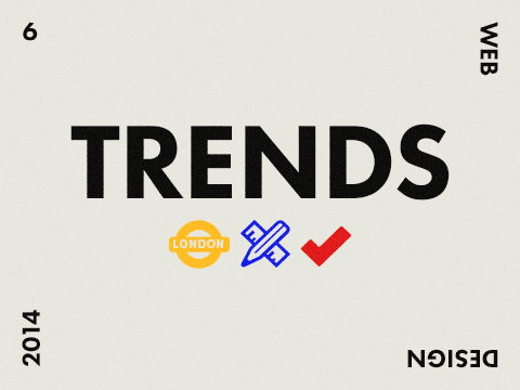
6 web design trends to look out for in 2014
Development
eCommerce
Design
Property
Copywriting
Careers
Web 101
This month, we have have decided to round up some trends appearing online for 2014.
Flat icons
2014 has seen icons evolve past apples Skeuomorphism style to accommodate the newer trend of icon, flat design. While some may argue Apple, Google and Microsoft haven't lead the way it's hard to ignore that if these giants adopt a style the world will follow suit. For me it's a welcome, an aesthetically pleasing look that fits perfectly into my own style of drawing. I love the creativity and use of colours these new icons bring, they feel like they belong on the web. As the web ages, tastes change, our needs increase and we start to rely more on our digital devices. Focus has shifted onto the User experience and written content, this has changed how we evaluate atheistic assets within web pages. It's not to say that our designs aesthetics are not important but there are so many other defining factors that need to be considered we must start to look at how we can make what we create more versatile. Flat icons can be stunning to look at but more importantly give us leverage to design assets that can be re-used in different ways. Simple one colour icons can be used as a reference for creating a standard clarification for objects online or using a SVG icon can be a complex functioning artefact, seamlessly integrated with code woven throughout.
Content pre-loaders
I think content pre-loaders from a Users perspective can be a lot like marmite. You either feel like its the flash website era all over again with needless site loading bars or you appreciate the site owner has taken the time to load the page in it’s entirety so that you have a better viewing experience. The underlying fact is it helps with browser performance by loading it all in a very clever way (too clever for me to simply explain here…). What has been interesting to see is how web designers and developers have gone about creating little branded loading icons that animate long enough to not be annoying then smoothly fade in the sites content. I tend to like this approach as it gives a sense of reliability and well engineered build quality to the overall experience. If sites could be a car when using this technique I think they would be a Volkswagen.
SVG
SVG hasn’t taken the web by storm just yet but it’s doing well and can only pick up momentum. The SVG object can be used in ways standard images just can’t compete with. It’s integration with interactions within a web page have lead to some very creative uses. The ability to manipulate an SVG with code creates endless possibilities and helps bridge a designers role within a developers field. Changing an SVG images state, colour, position, size and proportion have been some of it’s key strengths while only requiring a small amount of work. They only draw back seems to be it’s legacy support in older browsers but fallbacks and work arounds have all ready been well established as viable solutions. The most interesting trend to start emerging from SVG’s is subtly animated icons, keep your eyes peeled as these little gems are floating about waiting to be discovered.
Web typography
Custom fonts on websites is becoming more common every day and designers are no longer reluctant to use them. This is mainly down to the services provided by companies such as Typekit, Google fonts, ect… who have dotted the i’s and crossed the t’s to make sure it’s safe to use them. Sure we still have to worry about font fall backs and page loading times but we have options and its just down to how we use them. More and more sites are focusing on content first, cutting out the garble and getting the main message to us sooner and faster. This leaves the door open to an array of well designed, type lead landing pages/ hero sections appearing across the top of peoples websites.
Large hero images replacing sliders
It’s seems that we are seeing less and less of the big sliders cropping up at the top of websites. We ourselves adopted this route but felt it was too overwhelming and too much too soon for any new User to the site. The problem we felt was that a large hero slider had several different messages passing the User by too quickly. This created mixed messages preventing the User focusing on a singular task.
Que the large hero image...
By just showing one message at the top with one interaction or visual path we could help navigate the User down the pages content, drip feeding information in digestible chunks. After A/B testing the pages we watched our bounce rate drop by nearly 15% by just removing the slider in adoption of the hero image and as an added bonus our page speed increased due to fewer resources needing loaded.
Lazy loading
Sites adopting responsive layouts have been on everyones radar for a while now and most of us know it would be naive to ignore there popularity. What is important is creating an enjoyable experience and by focusing on page speed and bandwidth we can help aid this. Reducing these two factors for the User will greatly improve the experience they have while viewing your site which in turn reflects on the experience they have with your brand. Lazy loading fetches content defined by the developer to appear when needed. The results, quick page loading and reduced bandwidth usage. It would be unwise to adopt this technique for everything on your website but by adding a pinch of salt and pepper here and there you can greatly enhance the flavours of your site.
In conclusion
This just seems to be the beginning of a very exciting year and as these trends start to ripen news ones are only just starting to blossom. It's important to always remember that the trends that tend to stick have a shelf life based on how much they are able to evolve and adapt.
More posts in:

Copywriting
Why creating good written content is like scoring a symphony
Beautiful melodies build up one note at a time. What’s mind-blowing is that this unit, the individual note, means next to nothing on its own.

eCommerce
3 Tips To Help Stay On Top Of Mobile Commerce
It is no surprise that with the changes the advent of the internet has introduced to the world of technology, consumers are also changing in their behavior and expectations from businesses and brands.

eCommerce
Using engaging details to engage your customers
Don’t hold back, you want people to want you.

Development
Breaking down Cyber Security
Our recent project involved a UK Government-backed scheme, Cyber Essentials.
eCommerce
The Importance of Good Structure and Great Content, No Matter What You Sell.
So, you sell disposable paper cups..
eCommerce
Why Message Those Who Abandon Your eCommerce Site?
Cart abandonment is when somebody visits your website and does not complete a purchasing decision.

Copywriting
Why your writing isn’t finished when you think it is
In a digital world built on immediacy, a little patience will transform your writing.
eCommerce
Five Top Mobile Commerce Apps
eCommerce is a growing industry, in particular, the mobile ecommerce industry is rapidly advancing. Consumer behavior has changed, and people are more comfortable with sharing their payment details online.

Copywriting
How long should your blog posts be?
The definitive answer to this much-debated question might not be what you were expecting. Props to you if you already knew.
eCommerce
Two Ways To Retarget Lost Online Customers
Abandoned shopping cart is something that eCommerce experts love to talk about.

Copywriting
People don’t understand your writing. Here’s how to fix it.
Playing a simple game of catch can teach you a lot about getting your message heard.
eCommerce
Could Your Business Benefit From Social Commerce?
Social commerce is using online tools such as social media platforms to interact and build relationships in order to assist sales.

Copywriting
Win over new blog subscribers with a few simple words
There’s something ridiculously easy you can do to build an instant connection with new subscribers.

Careers
Now hiring - Business Development and Marketing Manager
Skills needed: Digital agency sales experience and proven success with impeccable attention to detail.

Copywriting
And never start a sentence with a conjunction...
There never has been - and never will be - anything wrong with starting a sentence with and or but. Here’s the skinny.
eCommerce
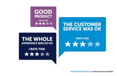
Ideas for big (and small) companies
Food for thought from booking websites' maps to user rating on ecommerce websites.

Copywriting
The importance of writing with purpose (and how to do it)
Irresistible copy requires you to zero in on a few fundamentals.
Copywriting
1 sentence that will help you stick to your blogging schedule
Keeping your blog updated with prime cuts of content is hard. This little trick may help to rein in your stress levels.
eCommerce
Does Your eCommerce Site Take Too Long To Load?
First impressions are important, and we judge people based on what we see before anything else.

Copywriting
What school didn’t teach you about writing for the web
If you’re dubious that your academic years were the biggest influence on your writing, here’s something to ponder.

Copywriting
Still think content is king? Think again.
When it comes to growing your presence online, the popular message is that quality content rules the roost. Fair enough, right?
Copywriting
New app claims to automatically improve your writing
With the European Commission and Harvard University among its users, Writefull has some pretty heavyweight ambassadors. Just don’t expect it to turn you into Hemingway.
eCommerce
Ways To Increase Traffic To Your eCommerce Site
When it comes to marketing an eCommerce website, increasing website traffic is usually something business people struggle with.

Copywriting
How often should your business be blogging?
It must be one of the most frequently asked questions in the blogosphere: How often should you post?

Copywriting
Ban this word from your business. Right now.
750,000 words capable of being wrought into sentiments that would bring a tear to the eye of Dickens

Copywriting
5 last minute tips for your email marketing this Christmas
Lights festoon the streets. Shoppers wear stroppy faces. Somehow, Christmas is here already. That means it’s time for three things: mince pie scoffing, mulled wine quaffing and making the most of your Christmas email marketing.
eCommerce
Why Mobile Commerce Is Key For Targeting Millennials
Millennials, 18-34 year olds, are not just, typically, known to be early adopters they are a growing population who will shape the future of all industries.
Careers
Development
Now hiring - Drupal developer
Skills needed: A love of good coffee, the ability to mix a killer Mojito, the willingness to learn new things and make fun out of WordPress developers!